

Is Maximalism Starting to Come Back?
Is Maximalism Starting to Come Back?
Trend forecasters say the new direction is "opulent simplicity." You could think of it as a more maximal version of minimalism.

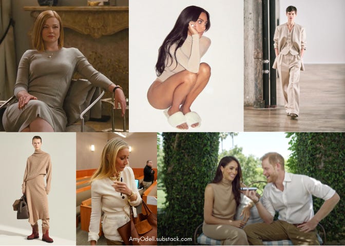
As we head into the second half of this decade, the dominant stealth wealth trend of luxurious, unidentifiable, minimalist clothes seems to finally be giving way to something new.
The spring 2025 fashion shows walking now are not exactly Shiv Roy in an oatmeal knit that could be Loro Piana or Armani or The Row. Fashion is evolving from that look, be it Shiv’s upscale professional suits or Kim Kardashian’s beige, tight stuff. That said, the collections have not quite reached the point of full-on maximalist glitz, as seen recently on Jennifer Lopez at the Toronto International Film Festival premiere of her movie Unstoppable. The Tamara Ralph disco ball gown held together at the sides and shoulders by big, luxurious, floppy black bows was a revenge dress of the highest order.
That stealth wealth has lasted so long seems counterintuitive. The trend cycle is generally publicized as lightning-fast thanks to TikTok, which drowns in “mob wife” videos one week and “blokecore” the next. Understanding that maximalism has to come back at some point, and that trends seem to flip-flop with the same agility as Simone Biles, could the stealth wealth bubble be popping?
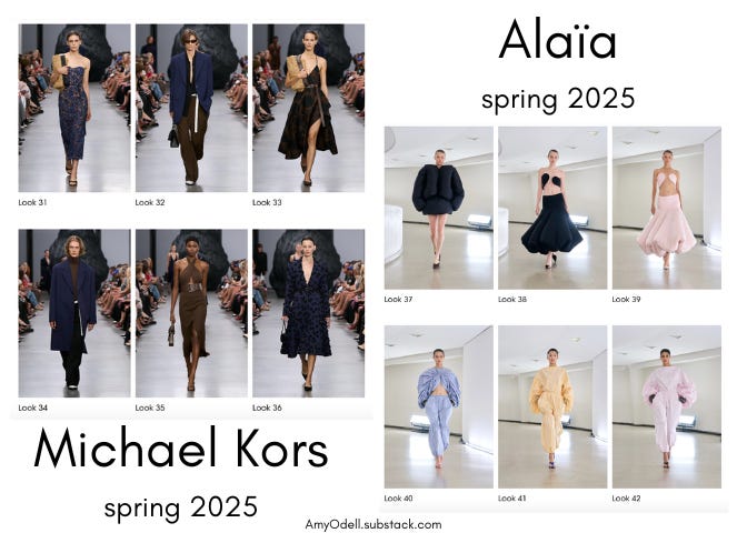
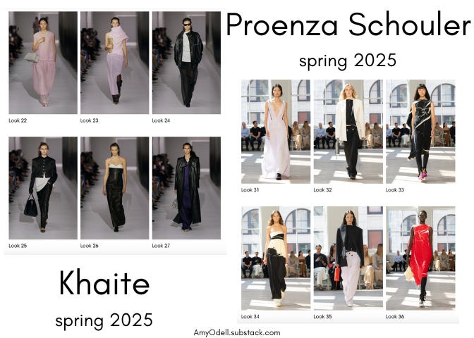
What’s mostly changed in clothes may be the colors. I loved the sterility of Toteme, but it also stood apart as surprisingly more colorless than minimalist bedfellows like Khaite, which showed the palest of pastels, and Alaïa, which showed mostly black and white but mixed in vivid blues along with yellow and pink pastels. Proenza Schouler also offered a neutral palette, accented with deep blue and red, and the very palest lavender.
This shift is not quite maximalism. While there will always be examples of that in culture — in interiors or makeup or elsewhere — Pantone Color Institute VP Laurie Pressman told me she calls the current look “opulent simplicity.”
“Opulent simplicity is this whole idea of opulent yet wearable. It’s bitter teal, purple, espresso, black — this whole other world of color that evokes a luxury reminiscent of a bygone era. The reds can fall into that, fiery fuchsias, and golds. It’s not just about being limited to neutrals,” she said.
These colors, though rich and vivid and removed from beige, are an evolution of stealth wealth. Also called quiet luxury, this look was understood to be a reaction to the pandemic, which crystallized the divide between the rich and everyone else. Those who could steal away to the comfort of large homes — while others had to put on a face mask, go to work, and hope for the best — wanted to feel rich but not look obviously so. Hence the embrace of unidentifiable, logo-free neutrals.
Coming out of the pandemic, Pressman said, consumers reassessed everything — not just how we want to look, but our entire value system. “People were reevaluating how they want to live. What’s important to me? What are our values? How do I want to spend my time, and how do I want to spend my money?” said Pressman. Consensus emerged: people wanted to slow down, and to buy things that lasted longer and could span different seasons, hence the rise of neutrals.
But then, we started to expand our concept of neutrals beyond beige and gray. “Green is nature’s neutral,” said Pressman. Going into 2025, we’ll continue seeing a lot of browns: “It’s an expansion of the neutral. It’s a fashion shade, but also a practical shade.”
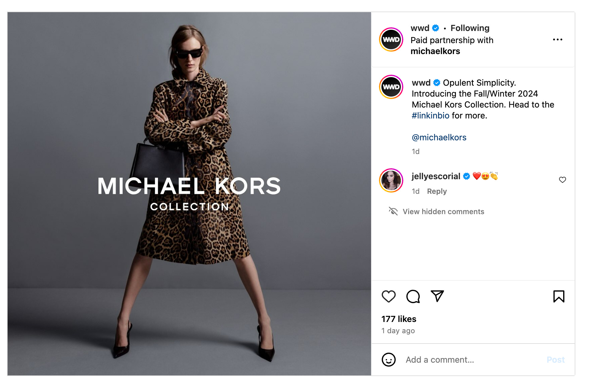
Michael Kors even called his fall 2024 collection “Opulent Simplicity,” and just released a campaign of the same title which highlights another of nature’s neutrals: leopard print.
The corollary to this is technology’s inescapable impact. During the pandemic, many of us were on our screens more, which created a craving for nature. But we’re accustomed to looking at a cell phone or computer, where color is lighter and cleaner, which explains the pastels.
“We have been through, not just the U.S. but every place, so much. And it’s been exhausting. I don’t want this heavy weight on my shoulders. I want utopia. I want a dream-like atmosphere. And that’s where the new-age pastels take you,” explained Pressman.
Opulent simplicity can be understood as the color juxtaposition of pastels and deeper, richer colors we’re seeing on the runways now (and once Pressman pointed this out to me, I saw it in just about every single new collection I scrolled through on Vogue Runway).
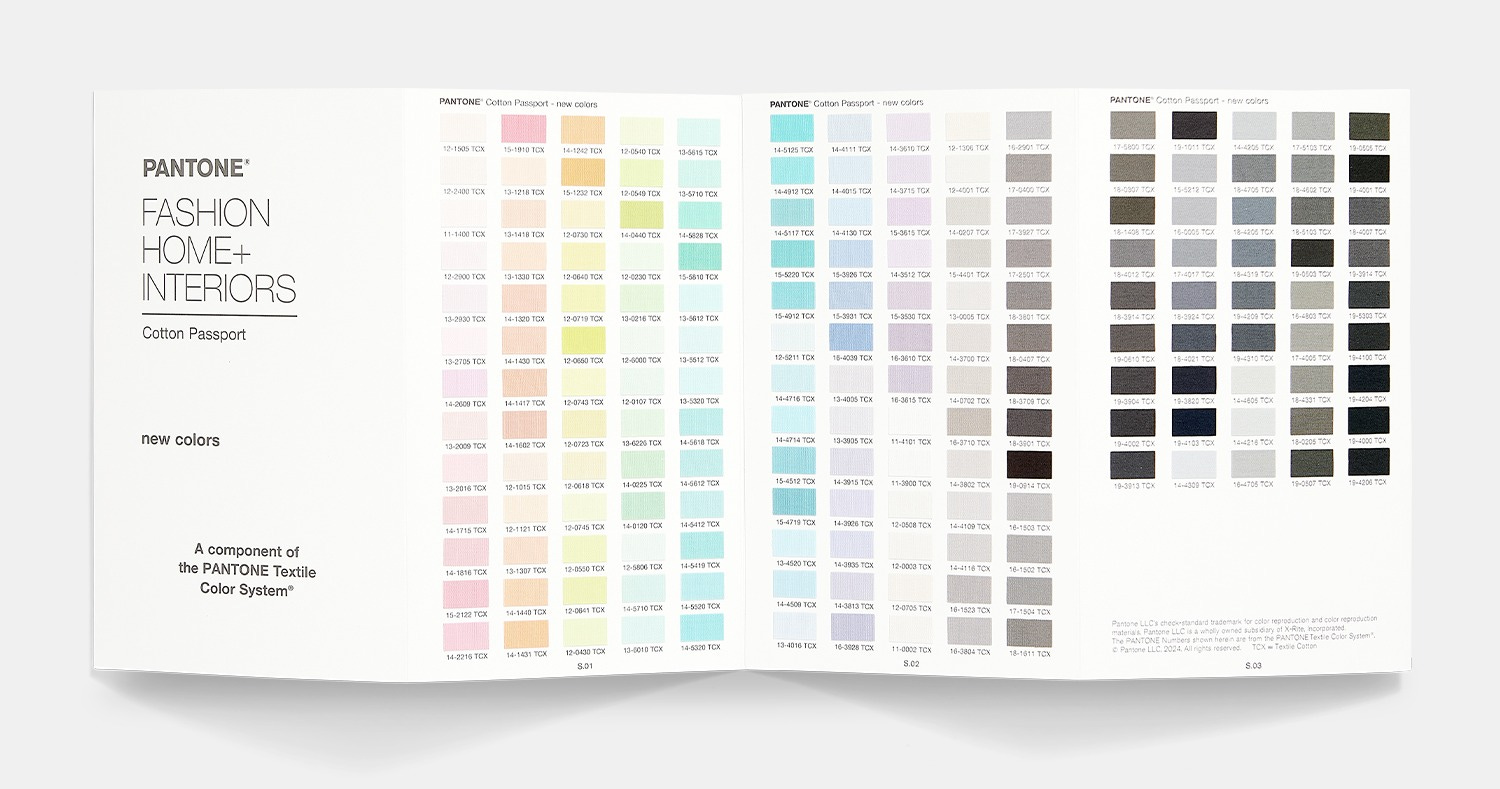
Pantone just released a new collection of 175 shades during New York Fashion Week in collaboration with Janavi and Bibhu Mohapatra, which fall into two categories: grays (our staple old neutrals) and pastels (new hues).
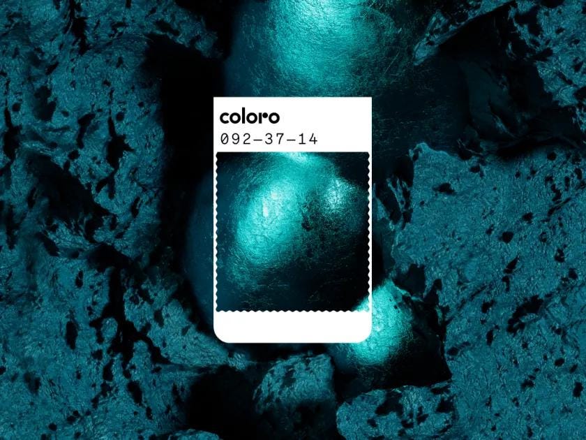
Trend experts elsewhere are telling a similar story about color and trends. This week, top trend forecasting firm WGSN and Coloro released the color of the year for 2026: “transformative teal.”
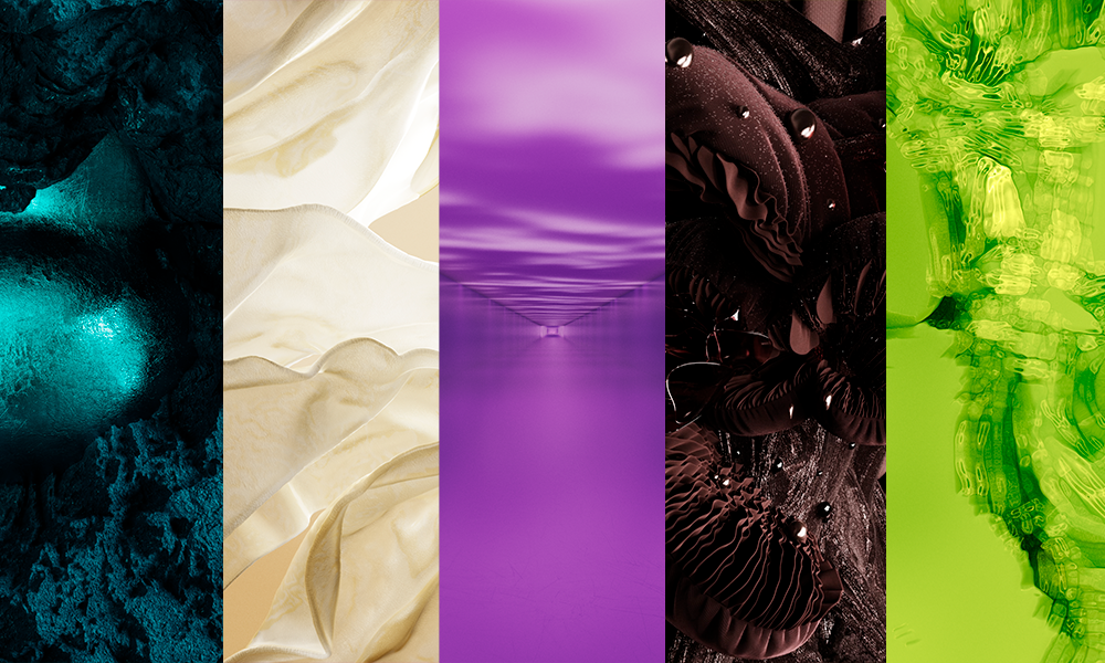
A release about the selection noted, as Pantone did, that “soft neutrals and pearlescent pastels… balance seasonal brights.” WGSN’s other “key colors” for fall/winter 2026/27 include wax paper, fresh purple, cocoa powder, and green glow.
Green glow looks like an evolution of Brat green — not that trend forecasters were surprised by Brat green. As nature’s neutral, green has been percolating since around 2017, when we were also feeling oppressed by technology and longing for something from the earth. It’s not entirely dissimilar from the seventies, which we strongly associate with muddy colors, which connect back to the beginnings of the environmental movement.
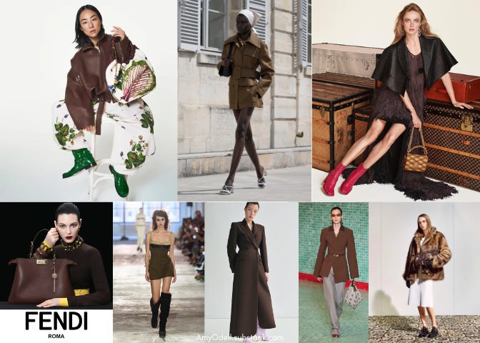
The evolution of brown itself is fascinating. U.P.S. chose brown as its color because it was associated with Pullman trains, luxury railcars popular in the nineteenth and early twentieth centuries. As perceptions shifted, brown felt less like a color of luxury, and rather one that symbolized durability. Around 2000, we saw what Pressman called the “Starbucks phenomenon,” which altered the meaning of brown once again. “Brown started to be about mochaccinos and chocolate fudge — the chocolate and coffee culture — and luxury once again plumbed the browns.”

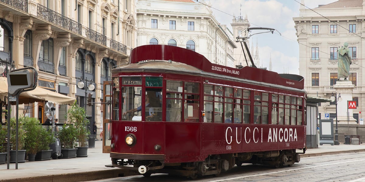
Expect to see more brands attempt to align strongly with a color, the way Charli XCX did with green. Taylor Swift, for instance, is known for her bright red lip. Gucci (which Taylor and her boyfriend Travis Kelce wore recently) came to deep red early with its “Ancora” rebrand just about a year ago (the color was also featured, perhaps with great intention, on old-timey trolleys in Milan when it first rolled out). We’re so accustomed to a cell phone screen, where we identify apps by a small square of color, and brands would be wise to play into the knee-jerk association we’re developing between colors and entities.
Opulent simplicity also evokes a more relaxed pace. In that same spirit, on Thursday, Valentino announced that it would hold fewer runway shows under new Creative Director Alessandro Michele, by presenting couture once per year and combining men’s with women’s.
I wondered how all those fleeting viral TikTok trends and the rise of Shein and Temu fit into this new mood. Pressman said that is more like a congruent fad culture, running in an entirely different but parallel lane to this new iteration of dressing — another juxtaposition, like the pastels paired with dark, vivid tones.
Shopping more slowly and thoughtfully without TikTok in mind is just one more way that luxury customers and aspiring luxury customers will distinguish themselves from, well, everyone else.
Loose Threads

Isabel Marant collaborated with Converse on a wedge sneaker. I feel like the industry keep telling us the wedge sneaker is coming back and then it never really does, but I guess we’re gonna keep trying!
The Cut’s Chantal Fernandez did a feature on Very Important Clients (VICs) who comprise 40 percent of luxury fashion sales. Apparently, they can cause friction at fashion shows because they are often tacky, which is unsurprising because if you were, say, a dedicated The Row client, you wouldn’t want to be seen at a big, flashy fashion show or influencer dinner. One client who spent a million dollars with one brand was not asked back because the creative director didn’t like her makeup, her high ponytail, or her pre-Ozempic body.
The Row has three new minority investors: the Wertheimer brothers, who own Chanel; L’Oreal heriess Francoise Bettencourt Meyers; and Imaginary Ventures, co-founded by Natalie Massenet. Check out Back Row’s in-depth look at how the Olsens run the brand if you haven’t yet.
Taylor Swift’s tartan situation on the VMAs carpet was by Dior — as was Kamala Harris’s suit at the debate. I am not a Swiftie but I feel they should be writing essays on this!
Chappel Roan wore Y Project on the VMAs arrivals carpet and accepted her Best New Artist award wearing Rabanne. Vogue.com talked to her makeup artist who said, “The inspiration came from Chappell and [stylist] Genisis’s medieval royal fantasy visions!” Yay swords!


Hurray for colour! Before stealth wealth, there was coastal grandmother. So it's really been several years of oatmeal mush. Bring on the rainbow!
It's bitter teal for me!